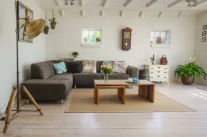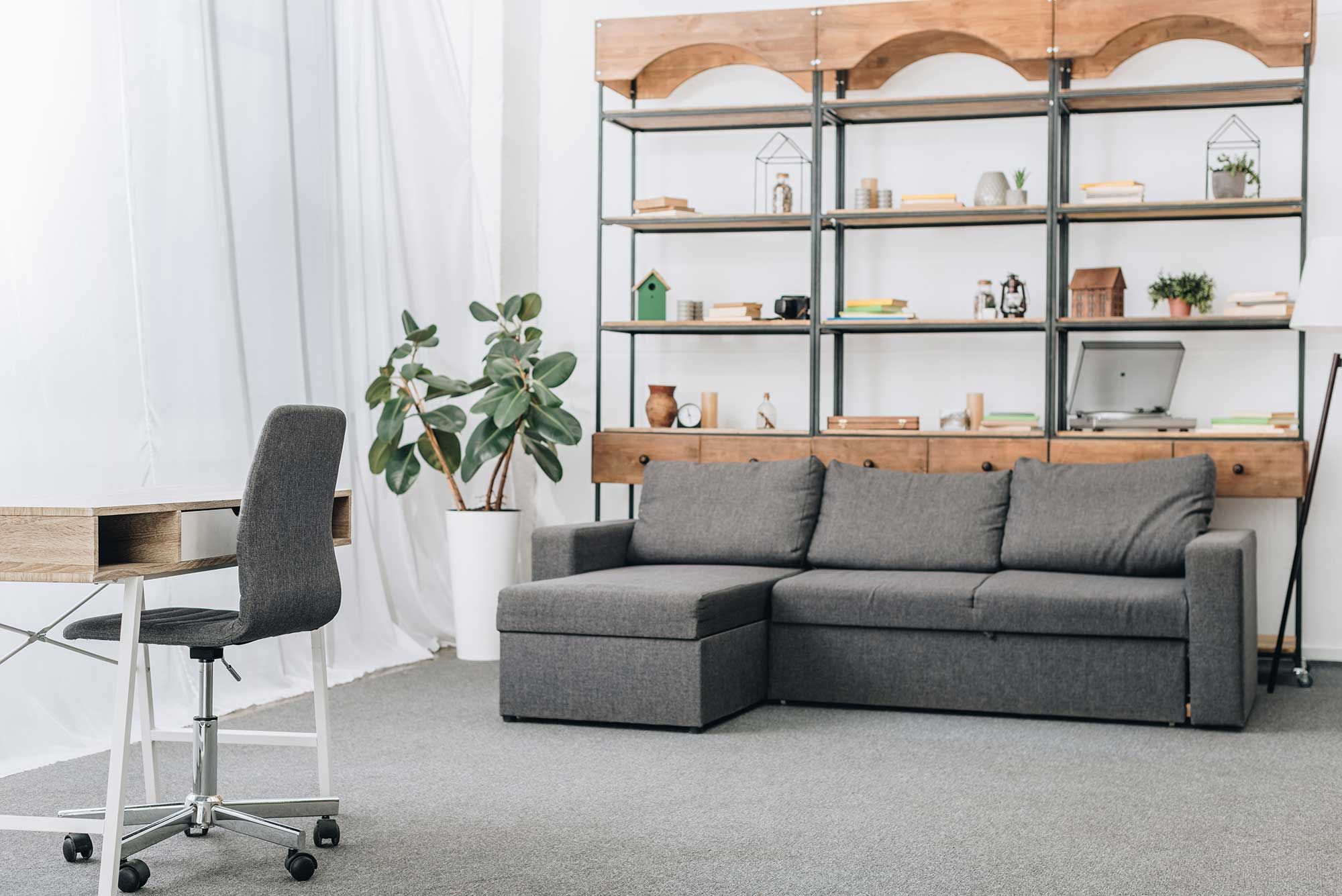
Colour sets the mood of every room. Here’s a simple, reliable method for creating a colour palette you’ll still love years from now.
Choosing colours for your home is one of the most exciting parts of an interior project. But with thousands of shades, tones and combinations to choose from, it can also become surprisingly difficult.
The good news? You don’t need to be an interior designer to create a beautiful, balanced colour scheme. With a simple framework and a little planning, you can take much of the guesswork out of choosing colours.
Start with the 60-30-10 Rule
One of the easiest ways to create a balanced colour palette is to follow the 60-30-10 rule.
Think of your room as being divided into three colour proportions:
- 60% – Dominant colour: Usually your walls, flooring and other large surfaces.
- 30% – Secondary colour: Furniture, curtains, upholstery and other medium-sized elements.
- 10% – Accent colour: Cushions, artwork, decorative objects and accessories.
For example, you might use a warm neutral across most of your walls, introduce soft green through your sofa and curtains, and then add touches of terracotta through cushions and artwork.
This simple ratio helps prevent a room from feeling either too plain or overwhelmed by too many competing colours.
Start with Something You Already Love
You don’t always need to start with a paint colour.
Instead, look around your home for something you already love. It could be a favourite rug, a piece of artwork, a patterned cushion or even a fabric you have been drawn to.
Use that item as your starting point and identify two or three colours within it. These colours can then become the foundation of your room’s palette.
This approach is often easier than choosing a wall colour first because you already have something tangible to work with.
Consider the Natural Light
Lighting can completely change the way a colour looks.
A colour that appears warm and inviting in a showroom may look completely different once it is on your wall at home. The direction of your windows, the amount of natural light and the time of day can all affect how you see a colour.
Rooms with cooler natural light can benefit from warmer tones that add a sense of comfort. Meanwhile, bright and sunny rooms can work beautifully with cooler shades such as soft greens, muted blues and deep teals.
Before making a final decision, always consider how much natural light your room receives throughout the day.
Think About the Mood You Want to Create
Colour isn’t just about appearance. It can also influence the atmosphere you want a room to have.
If you’re creating a bedroom or relaxing living space, soft blues and greens can help create a calm and peaceful feeling. Warm neutrals can make a space feel comfortable, welcoming and timeless.
If you want something more dramatic, deeper colours can introduce richness and intimacy.
Before choosing your palette, ask yourself a simple question:
How do I want this room to feel?
Your answer can help guide your colour choices.
Always Test Your Colours Before Committing
One of the biggest mistakes when choosing paint is relying solely on a small colour card.
Instead, test your chosen colours directly in the room. Paint large swatches on at least two different walls so you can see how the colour behaves in different areas.
Then look at the samples at different times of the day:
Morning → Afternoon → Evening
Natural and artificial lighting can dramatically change how a colour appears. A shade that looks perfect in the morning may appear much warmer or cooler in the evening.
Taking the time to test your colours can save you from an expensive repaint later.
Create a Natural Flow Between Rooms
Your home doesn’t need to have exactly the same colours in every room.
However, having a visual connection between spaces can make the entire home feel more cohesive.
For example, you could repeat the same warm neutral throughout different rooms while introducing different accent colours in each space.
Another option is to carry one accent colour from room to room through smaller details such as artwork, cushions, rugs or accessories.
The goal isn’t to make every room identical. It’s to make the colours feel like they belong together.
Keep It Simple
A beautiful colour palette doesn’t necessarily require lots of different colours.
In fact, using fewer colours thoughtfully can often create a more sophisticated result.
Choose a small selection of colours and repeat them throughout the room in different ways. A neutral wall might be complemented by similar tones in furniture, while a stronger accent colour appears in artwork, cushions or decorative accessories.
Restraint and repetition are often the secrets to a well-balan